The National Organization of Rheumatology Managers (NORM) is a forum that promotes education and advocacy for rheumatology managers and their practices. NORM provides value across the nation by cultivating a thriving community of rheumatology managers and physicians.
THE CHALLENGE
NORM has been a client of Sage Islands for many years, and while we created their original website and branding, nearly six years later, it was time for a refresh. They needed a more modern and cleaner feel as they head into a new era and a new year. The Sage Island team was excited to dive in and revamp their style and branding.
THE SOLUTION
A fresh new logo.
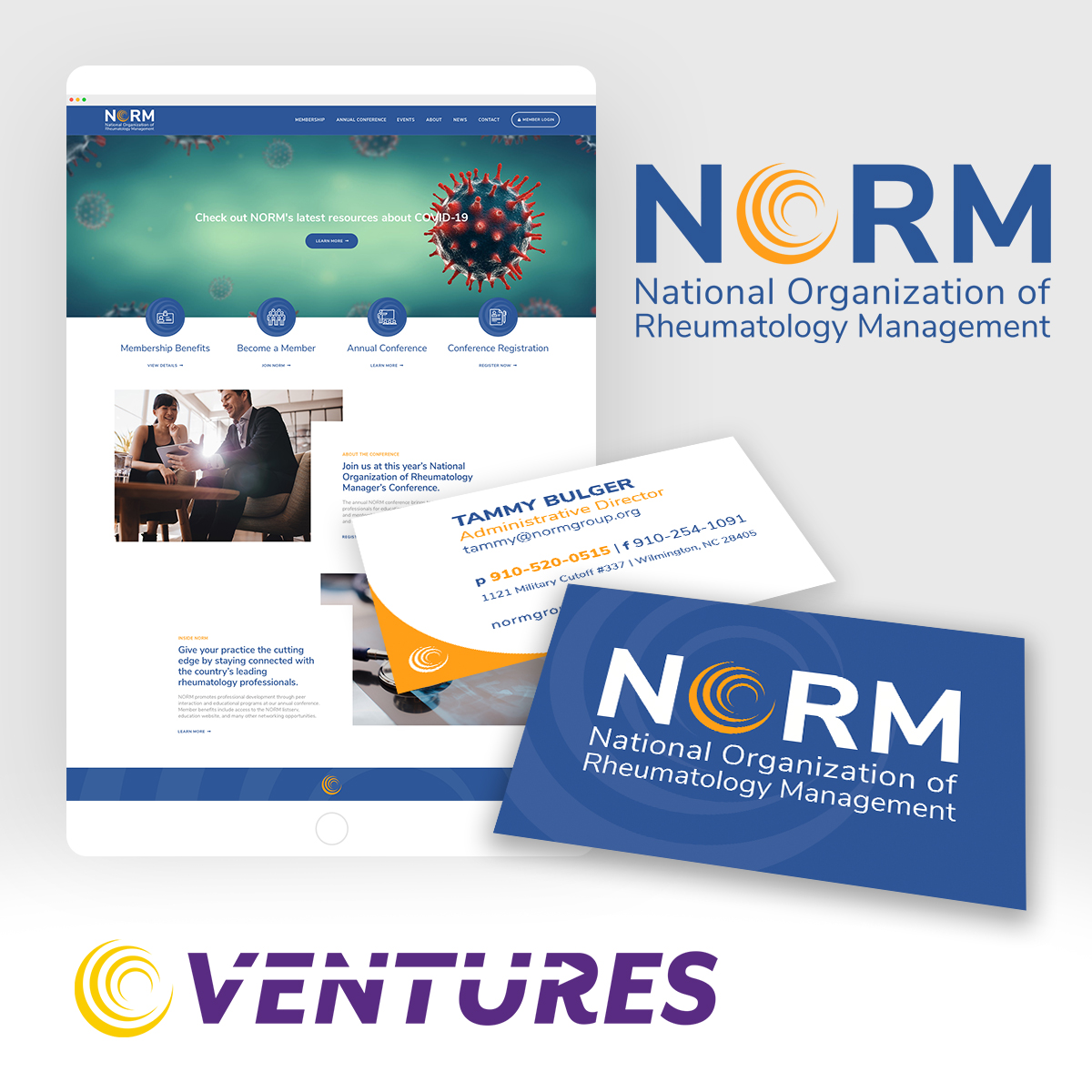
NORM’s logo is very well known and a part of their identity, so it was crucial that we didn’t deviate too much. However, they needed something sleeker and more modern that reflected who they were and their level of professionalism.
Our designers came up with several preliminary sketches and color schemes as they worked toward a solution that embraced the world of Rheumatology Office Management. The logo mark needed to fit its target demographic niche while still reflecting the company and services. The color scheme was an important piece; it was important we stay in line with current colors while boosting the boldness and switching things up to make it stand out.
A slightly rebranded website.
In addition to vamping up the logo, the website as a whole needed a mini-makeover as well. We added some color elements to match the logo and brighten up the site while adding some features to make it more user friendly. In addition, we cleaned up the content, added links, removed broken links, and made the copy more SEO friendly for better rankings.
We also wanted to add some graphic elements that made the site more aesthetically pleasing to visitors. Images that depict people in professional settings helped drive home that desired feel.
NORM’s previous website followed a standard block design, so we decided to shake things up by adding custom-designed buttons to help direct users toward the website’s various pages and essential points.
New business cards.
After the logo was approved, Sage Island designed a suite of branded items for the company, including new business cards. These communication materials help cement the company’s new brand identity and present a unified organization to its community.
A rebranded PowerPoint template.
And finally, our design and development team created a PowerPoint presentation template for NORM’s professional use. Using all the vibrant colors and graphics from the refreshed site, we made an easy-to-use template that can be edited on the fly for those last-minute meetings.
THE RESULT
The result is an intuitive user experience and well design brand identity that travels across many mediums. Visually, the new branding style better reflects the NORM identity and draws in current and potential members. Check it out below!


