Fiore Fine Flowers’ passion for style and inspirational designs make them a premier full-service florist in Wilmington, North Carolina.
Fiore’s expert designers are all about chic and elegant style. They stay on top of the current design trends and a supply plethora of talent. They maintain a high standard of quality and have a deep love for all things pretty.
Fiore’s design team cultivates an exclusive and intimate experience with every client to guarantee each impressive floral design is as captivating as the clients themselves.
THE CHALLENGE
The first step in creating a logo for Fiore Fine Flowers was establishing a concept that reflected their passion and style. The team at Fiore Fine Flowers believes that quality, talent, and amazing customer service are the critical elements of their award-winning floral designs.
Our graphic design team wanted to ensure the logo truly showcased this and the expertise behind the Fiore name. But it was also imperative that their new logo reflects the elegance and style that goes into each one of their arrangements.
THE SOLUTION
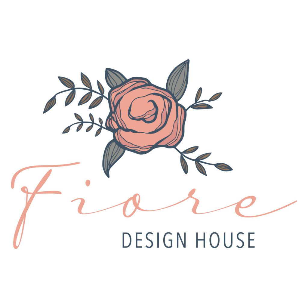
Because they work with flowers and greenery, we wanted a color pallet that echoed the beauty of nature. It needed to be bold enough to stand out among the competition, but it also needed to be refined and sophisticated to convey their brand and style. We ended up with the perfect balance of coral and peach for the light and airy vibe, which was the perfect juxtaposition against natural navy, gray, and hunter green.
A large part of our team’s attention went to the font in the signature. While it may seem like a small piece of the puzzle, we needed to pick the perfect design to flatter the color scheme and the eventual mark portion of the logo. The design team added a flowing natural element to the font, which was meant to mimic the natural curves and bends found in flowers and landscapes. Because Fiore maintains a high standard of quality and a deep love of all things pretty, we wanted to capture this in their logo with a beautiful color scheme complimented by an exquisite font.
The mark was the final portion of this lovely logo. We really wanted to leave no questions about who Fiore Fine Flowers is and empathize what they do. The flower represents the business that they are so genuinely passionate about.
THE RESULT
The final result is a graceful yet bold logo that suggests innovation, creativity, and beauty – which is precisely what the team at Fiore Fine Flowers is all about!
Their new logo showcases the Fiore brand and everything that they consider important.
If your company is looking for a professional logo that represents your company and its brand, contact the Sage Island team today!