Pest Patrol is a local Wilmington company that keeps you pest-free all season long.
Their vast certifications mean that you get highly qualified specialists getting rid of any pest problems. As a new company under the umbrella of another, they needed to develop their own brand identity, and a new logo was the best place to get started.
THE CHALLENGE
The first step in creating a Pest Patrol logo was creating something that stood apart from their parent company, Mosquito Patrol, but also stayed with a similar theme. It was important that potential clients recognized it as part of the Mosquito Patrol family and knew it was a completely separate entity.
Our talented graphic design team wanted to ensure the logo truly showcased the Pest Patrol company and the essential services they offer.
THE SOLUTION
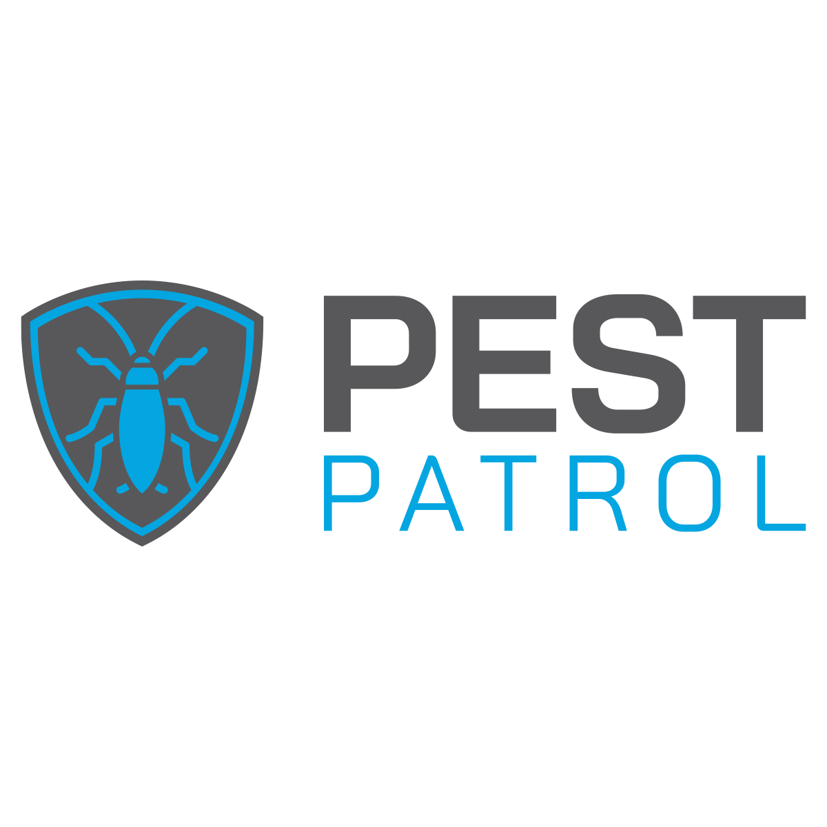
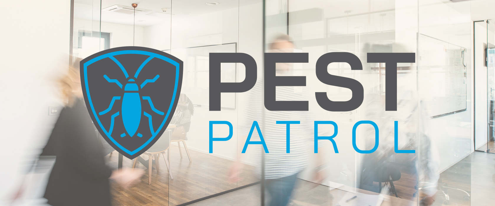
We focused on an icon logo design, the font of the signature, and the color scheme to guarantee the Pest Patrol logo would fit in among the industry yet stand apart from the competition. Our designers came up with several preliminary sketches and color schemes as they worked toward a solution that embraced the world of extermination and instantly grabbed attention. The logo mark needed to fit its target demographic niche while still reflecting the company and services. The shield-shaped icon with the geometrically designed pest in the middle was the ideal combination.
The color scheme was also crucial to this design. We experimented with several color pallets but finally settled with the natural and vibrant blue color pallet. The natural echo nature and the outdoors, but the blue added a pop of coastal color that made it stand out.
The logo signature was the final piece of the puzzle. Since Pest Patrol wants to be the leading authority in extermination services, we wanted to mimic that in the font. The design echoes its standard of service while playing on the word patrol and emphasizing the company’s expertise.
THE RESULT
After a few rounds of brainstorming, tweaking, finalizing, a new logo was born. After all, perfection takes time, and we are all about creating the ultimate final product for our clients. The Pest Patrols’ new logo is strong and authoritative and suggests protection and safety from pest— much like the company itself!
If your company is looking for a robust logo that represents your brand, contact the Sage Island team today! And in the meantime, inspect Pest Patrols’ new logo a little closer below.


