The Historic Wilmington Foundation is a historic preservation nonprofit with a mission to preserve and protect the history of New Hanover, Pender, and Brunswick counties.
For nearly a decade, the foundation has trusted Sage Island with various branding and digital marketing projects.
THE CHALLENGE
The Historic Wilmington Foundation tasked Sage Island with redesigning its website to improve the functionality and aesthetics. The website needed to both provide information about the foundation and convert leads by persuading people to donate, volunteer, or become a member. This project also presented a unique branding challenge; the foundation wanted to rebrand but could not change its logo because the mark appears throughout Wilmington on collateral, signage, and plaques.
THE SOLUTION
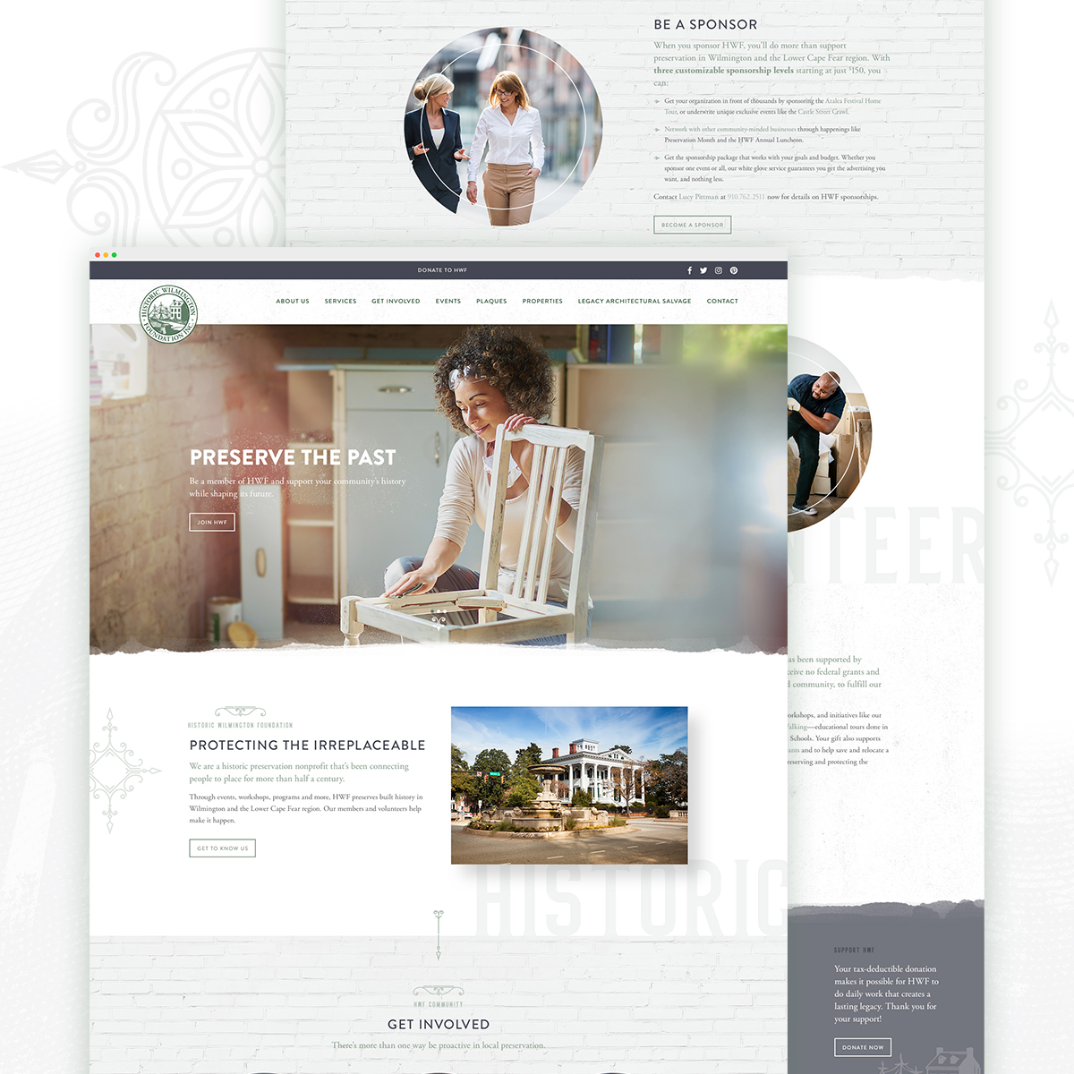
Secondary brand color.
Our design team worked with the client to select a shade of purple to complement the client’s primary brand color: green. We used this color to highlight call-to-action buttons and other elements throughout the site, which helped give the brand a fresh identity without changing the logo mark.
Contrasting aesthetic.
The client wanted the website to represent the foundation’s fresh and exciting energy as well as its mission of preserving and celebrating history. Our design team communicated these contrasting themes by utilizing current design trends and bright colors while incorporating textures, patterns, and other ornate details that created a more vintage aesthetic.
Every element of the design, programming, and copy supported this “old and new” concept, down to the smallest details. We contrasted modern sans-serif typefaces with stately serif typefaces. Our designers gave each page visual interest by using textures like aging bricks and distressed paper. Our copywriters tweaked the language used throughout the site to ensure the copy’s tone was consistently warm but professional.
Engaging imagery.
We used imagery to help support the client’s goal of encouraging involvement in the foundation. While the client’s former site had mostly architectural photography, we filled the new site with images of excited, youthful-looking people. This imagery humanized the site and will help potential volunteers, donors or members envision themselves supporting the foundation’s mission.
THE RESULTS
The final result is an aesthetically pleasing and well-organized website that accomplished its goals of protecting the irreplaceable.
Check out the final product here.